Logos

Photo of horizontal version of logo on a document.
oplus_32

The Seacoast Maritime Education Alliance is a collaboration of nonprofit organizations in the Seacoast area of New Hampshire, dedicated to honoring our coastal area and teaching others about its value.

They needed a brand identity to unite their organizations. I was an intern for Seacoast Science Center at the time, one of the members of SMEA, and my boss and mentor approached me about designing a logo for the group. I couldn’t wait to start working on it!

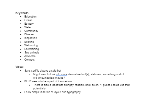
I started creating this logo by researching each of the organization’s members. I took notes on their visual identities and created a mood board based on my findings. This allowed me to sketch and develop concepts.

Mood board for SMEA logo, with images of sailboats, a whale, logos for organizations in the alliance, and color scheme ideas.
  • Anchor, whale tail, and sailboat pencil sketches on graph paper for SMEA logo.
  • Sailboat and lighthouse sketches for SMEA logo brainstorming phase.
  • Pencil sketches for SMEA logo brainstorm, including an anchor and knots.
  • Word map for SMEA logo, including words like 'learning' and 'ocean.'
  • Pencil sketches on graph paper for SMEA logo, including an anchor, a lighthouse, and a sail.
Screenshot of research on organizations in the Seacoast Maritime Education Alliance, including keywords like 'community' and 'welcoming,' and notes on visuals like common fonts and colors.
Seacoast Maritime Education Alliance logo concepts; the first has a whale tail and sailboat with waves in triangular shapes, the second has a sailboat and lighthouse in the center of a circle with the organization name, and the third has a logomark with a whale tail silhouette against a sailboat in a waterdrop shape.
Vertical and circular versions of the Seacoast Maritime Education Alliance logo with wave, whale tail, and sailboat in black and white and in color

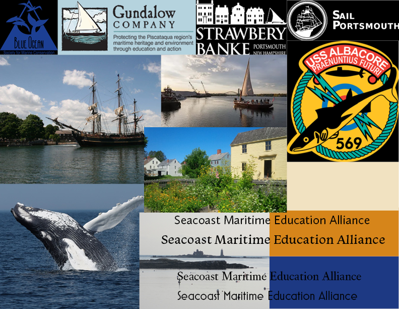
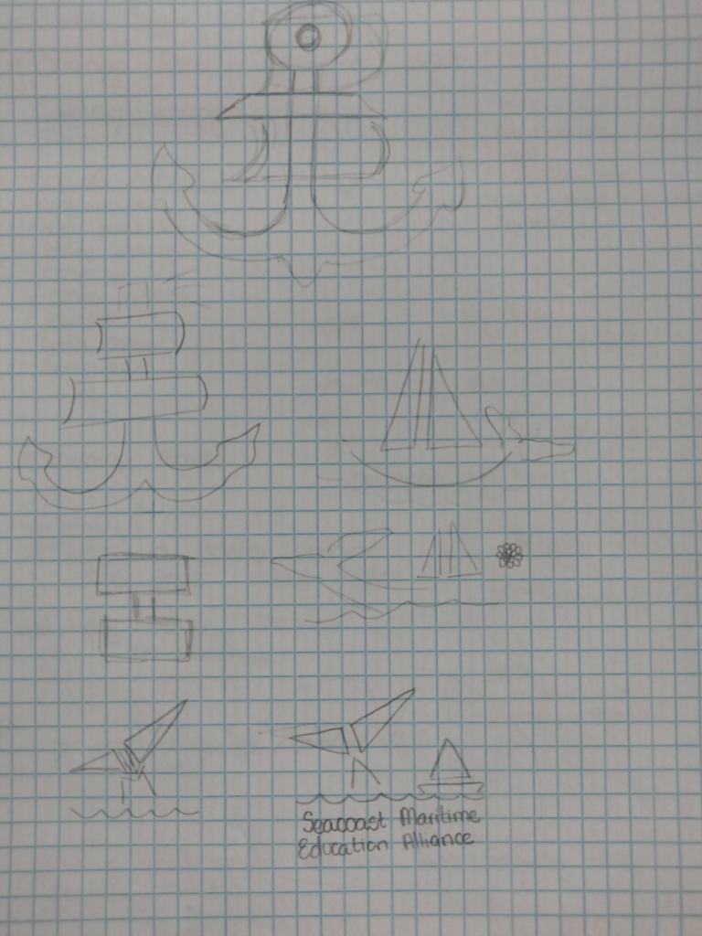
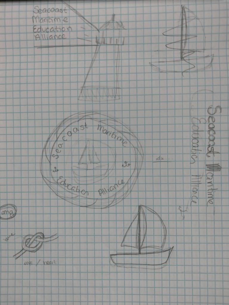
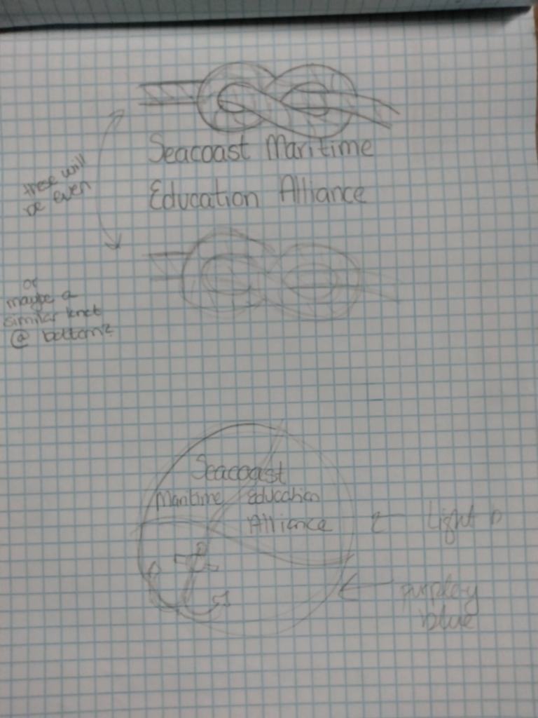
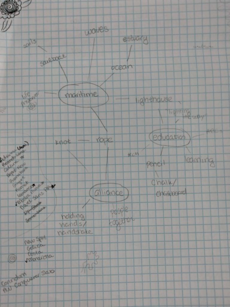
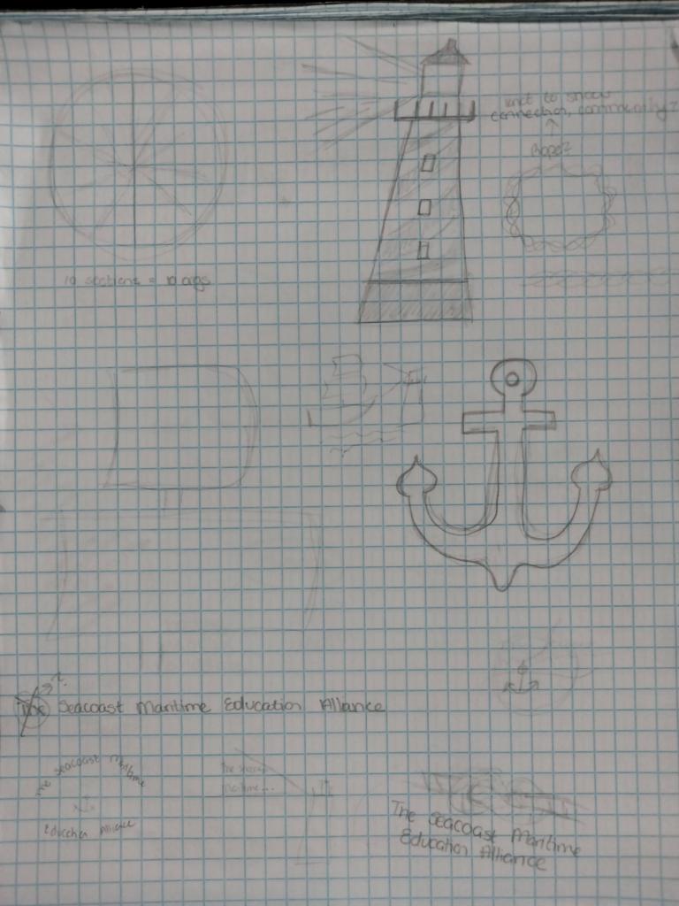
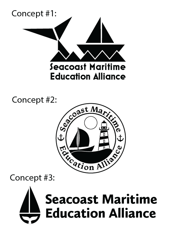
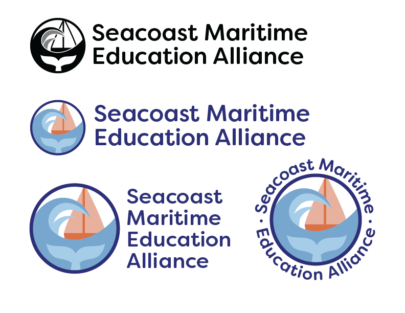
They identified most with the third concept but thought the branding should reflect Go Portsmouth’s, as the organization’s landing page would be a part of that website. So, I merged the two.

Black and white and color versions of both circular and horizontal versions of Seacoast Maritime Education Alliance logo with gundalow sailboat, whale tail, wave.

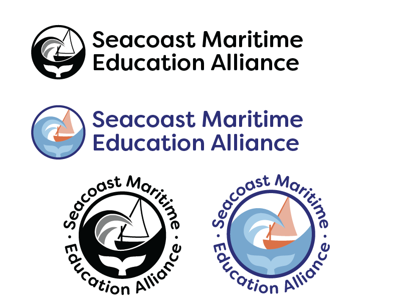
At the following meeting, it was pointed out that the Gundalow is considered “quintessential Portsmouth.” With a few tweaks, I adjusted the sailboat to look like a Gundalow. The result was a logo that combined colors commonly found in the industry, branding that matched the umbrella the organization fell under, and imagery that united each of its members.

BeatsFest logo with microphone mascot logomark.
  • BeatsFest style guide cover page, with mockups of logo on a document and a t-shirt, the logo itself, and circular shapes.
  • BeatsFest style guide table of contents.
  • BeatsFest style guide introduction, and vision, personality, and tone of voice of the brand.
  • Target audience and competitor analysis for the BeatsFest style guide.
  • Rotation guidelines for the BeatsFest logo, with a graphic showing which orientations are acceptable.
  • Clear space and scale guidelines for the BeatsFest logo, with graphics showing minimum size and amount of clear space.
  • Transparency guidelines for the BeatsFest logos, with images showing which opacity is acceptable.
  • Contrast guidelines for the BeatsFest logo, with images showing acceptable color contrast between logo elements and the logo and its background.
  • Guidelines for the BeatsFest logo regarding which color logo to use for different colored backgrounds to ensure necessary contrast.
  • Guidelines for typography within the BeatsFest brand, including typefaces and styles for headlines and subheadings.
  • Colors of logo and brand for BeatsFest, including hex codes, CMYK, and RGB color codes.
  • Guidelines for how to place the BeatsFest logo in documents.
  • Guidelines for how to place the BeatsFest logo in images, with examples.
  • Works cited for BeatsFest brand style guide.

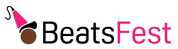
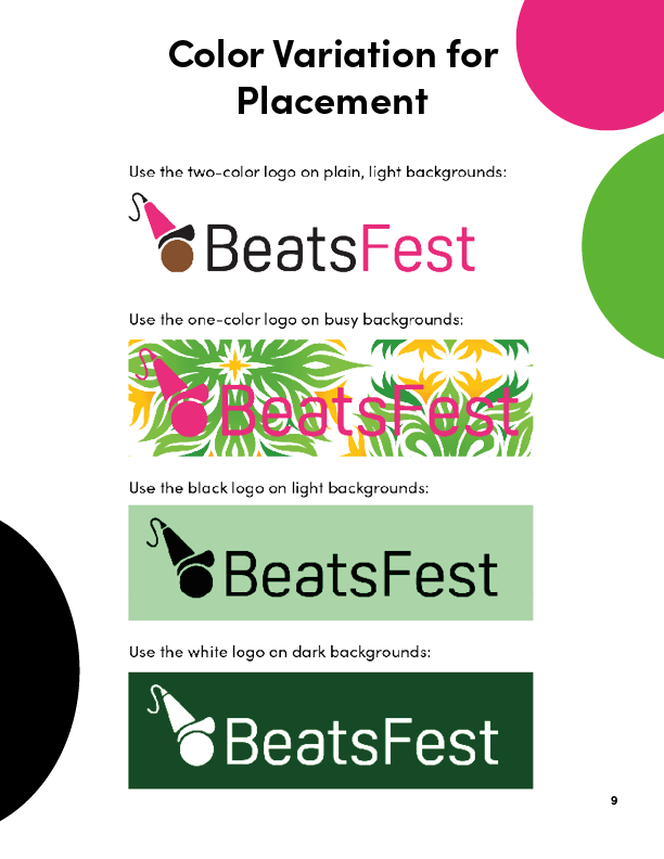
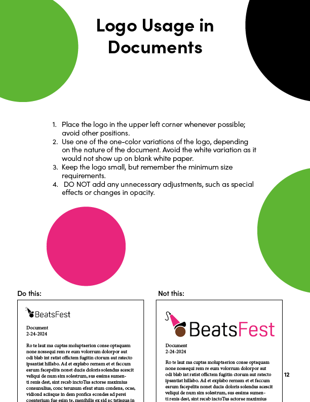
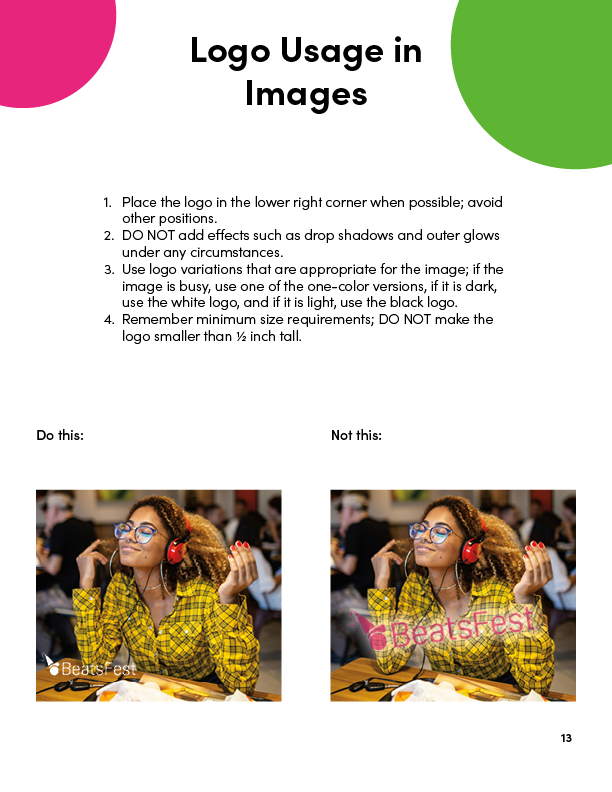
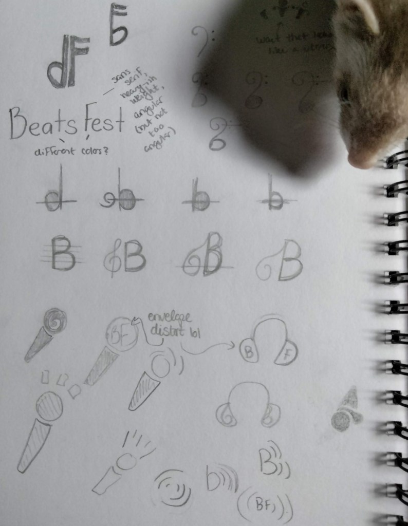
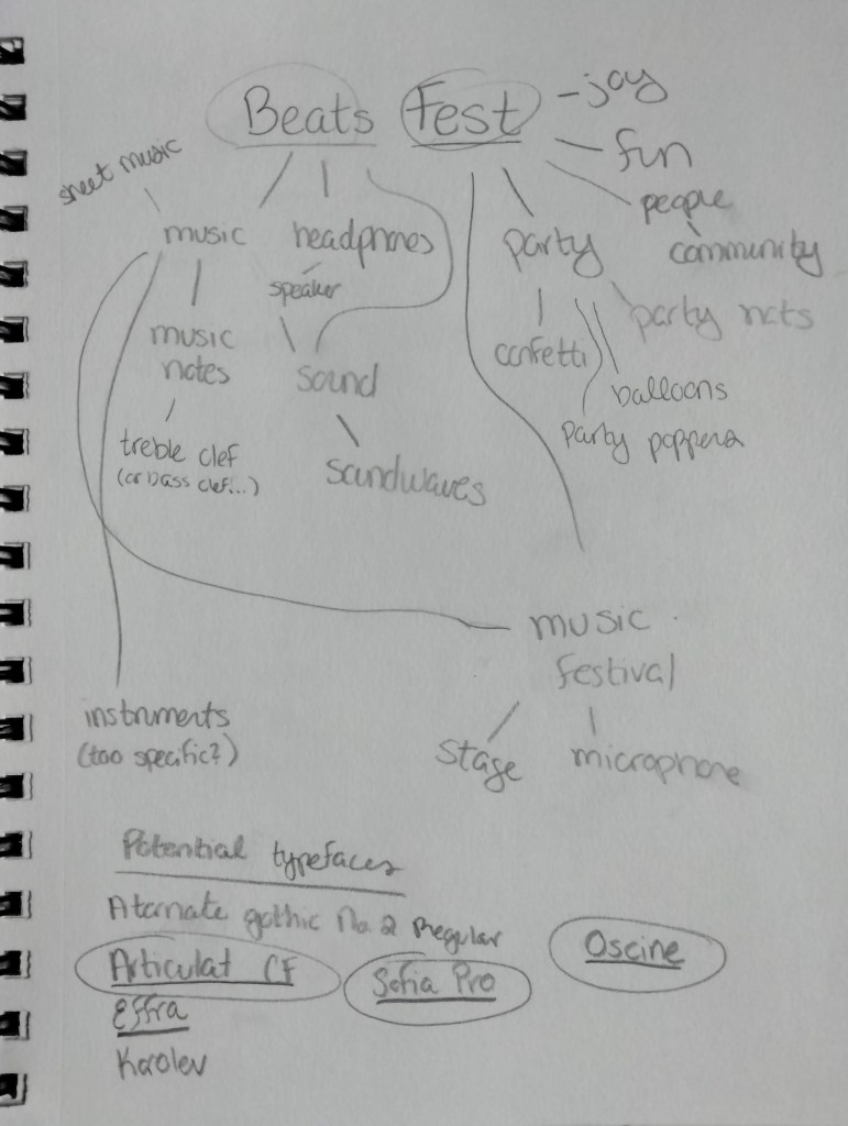
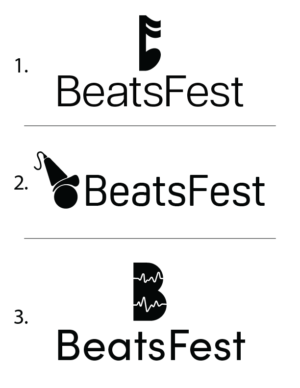
BeatsFest is a (fictional) music streaming service that caters to a young, diverse, tech-savvy audience.

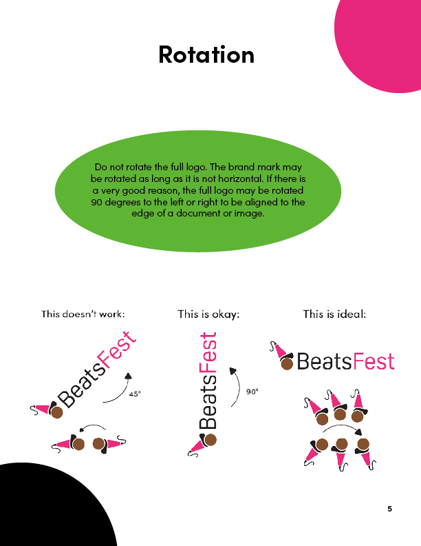
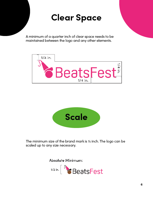
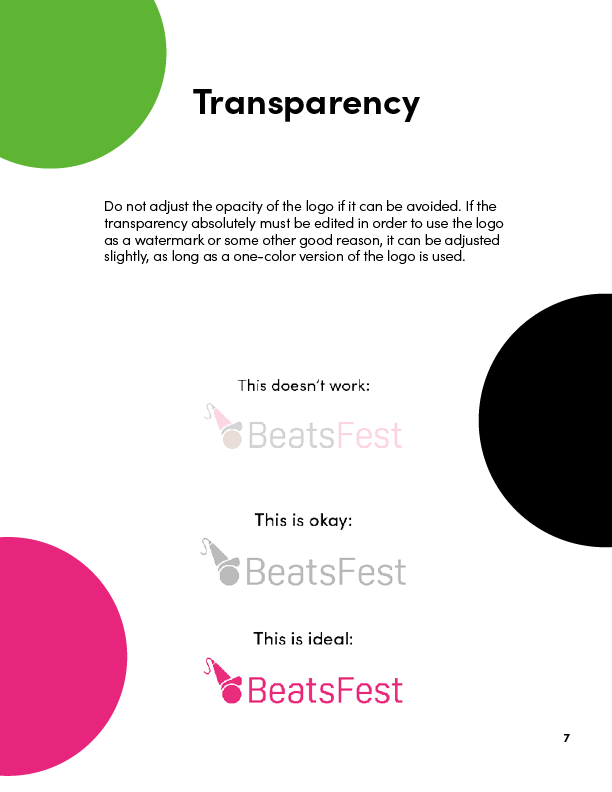
To reach the audience, I created a logo with their visual preferences in mind. The logo mark combines a representation of music (a microphone) with a cool guy in a party hat, making the logo a member of the fun, diverse group of people it is meant to appeal to. The bright pink represents the vibrancy Gen Z prefers, the sans serif font appeals to their modern sensibilities, and the fun, unique logomark reflects themselves.

  • Photo of sketchbook with BeatsFest pencil sketches of logomarks and word map.
  • Pencil sketches drawn during the brainstorming stage of the BeatsFest logo, with variations on music notes, microphones, headphones, the letter 'B' (and a ferret peeking out in the corner!).
  • A word map in pencil based on the company name 'BeatsFest.' with keywords like 'sound' and 'fun.'
  • Different early versions of the BeatsFest logo; one based on a music note, one with a microphone mascot, and one with a 'B' with soundwaves.
  • BeatsFest logo in color and black-and-white.
Ravenhollow Bodywork & Botanicals logo with raven and vine.
Photo of Ravenhollow business card with leafy background.
oplus_0

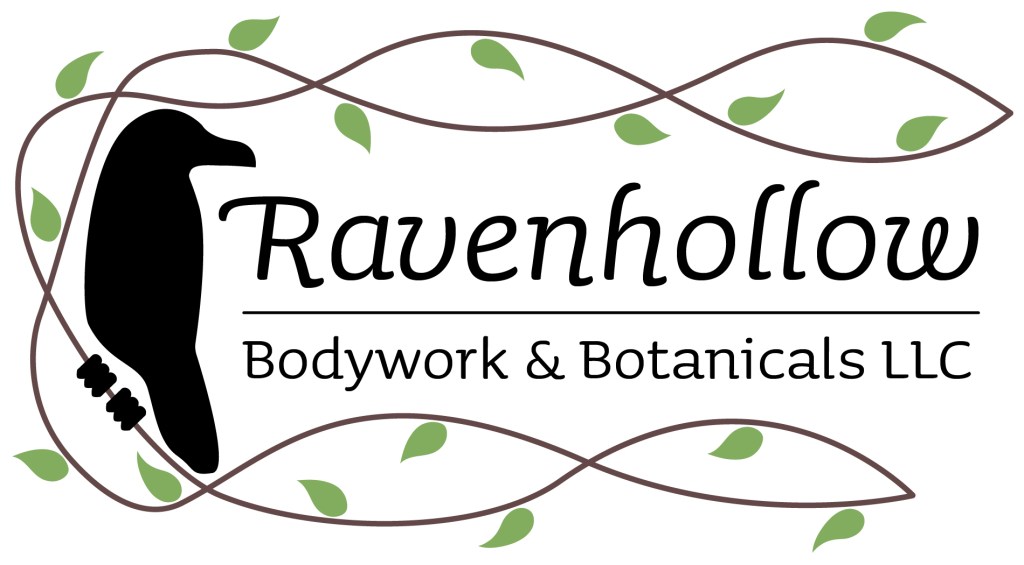
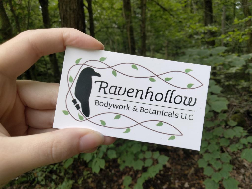
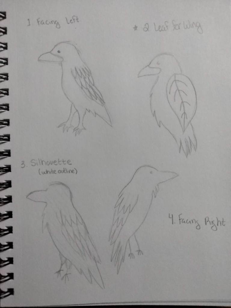
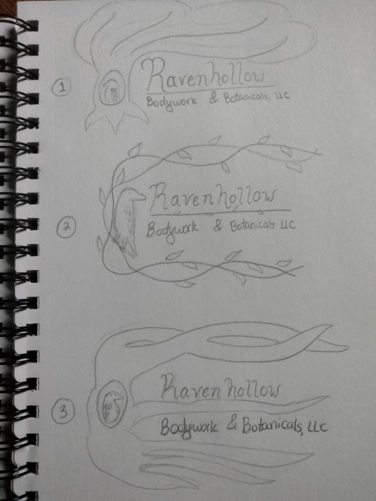
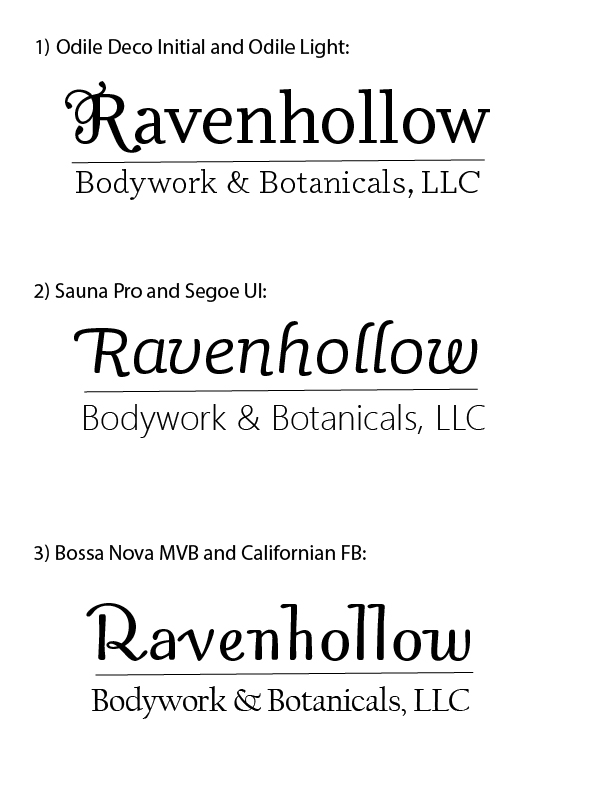
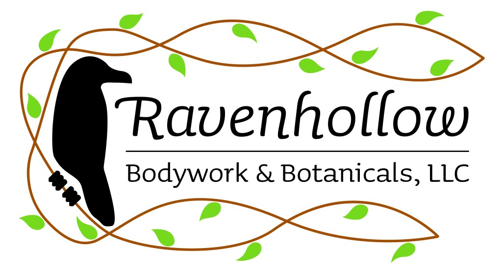
Kelly, the owner of a local massage therapy business, came to me with a clear idea of what she wanted.

She was picturing a raven in a tree as part of her logo. With this in mind, I created a vine-like image, reminiscent of Ravenhollow’s holistic and natural business practices. The raven faces the business name, which is in a personable font with some personality. The leaf imagery and earth tones represent the calming, natural environment Kelly creates, and the black of the raven and business name reflects stability. These color choices invite people looking for a relaxing experience.

  • Sketches of ravens in different orientations and styles for Ravenhollow logomark.
  • Sketches of Ravenhollow logo with different styles of trees, vines, locations of raven.
  • 'Ravenhollow Bodywork & Botanicals, LLC in three different typefaces.
  • Different color variation of Ravenhollow Bodywork & Botanicals LLC logo.